
Security News
Oracle Drags Its Feet in the JavaScript Trademark Dispute
Oracle seeks to dismiss fraud claims in the JavaScript trademark dispute, delaying the case and avoiding questions about its right to the name.
By Sarah Gooding - Feb 07, 2025
emoji-mart
Advanced tools
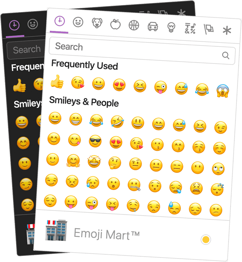
emoji-mart is a comprehensive emoji picker component for React applications. It provides a user-friendly interface for selecting emojis, supports custom emojis, and offers various customization options.
Emoji Picker
The basic emoji picker component allows users to select emojis. The selected emoji is logged to the console in this example.
import { Picker } from 'emoji-mart';
import 'emoji-mart/css/emoji-mart.css';
function App() {
return (
<div>
<Picker onSelect={emoji => console.log(emoji)} />
</div>
);
}Custom Emoji Set
Allows the addition of custom emojis to the picker. In this example, a custom emoji is added and can be selected.
import { Picker } from 'emoji-mart';
import 'emoji-mart/css/emoji-mart.css';

const customEmojis = [
  {
    id: 'custom1',
    name: 'Custom Emoji 1',
    short_names: ['custom1'],
    text: '',
    emoticons: [],
    keywords: ['custom', 'emoji'],
    imageUrl: 'https://example.com/custom1.png'
  }
];

function App() {
  return (
    <div>
      <Picker set='custom' custom={customEmojis} onSelect={emoji => console.log(emoji)} />
    </div>
  );
}
Emoji Search
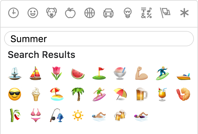
Provides a search functionality within the emoji picker. Users can search for emojis by keywords.
import { Picker } from 'emoji-mart';
import 'emoji-mart/css/emoji-mart.css';

function App() {
  return (
    <div>
      <Picker onSelect={emoji => console.log(emoji)} showPreview={false} showSkinTones={false} />
    </div>
  );
}
Customizable Skin Tones
Allows users to select different skin tones for emojis. This example shows the skin tone selector in the picker.
import { Picker } from 'emoji-mart';
import 'emoji-mart/css/emoji-mart.css';

function App() {
  return (
    <div>
      <Picker onSelect={emoji => console.log(emoji)} showSkinTones={true} />
    </div>
  );
}emoji-picker-react is another React component for selecting emojis. It offers a simple and lightweight emoji picker with support for custom emojis and various customization options. Compared to emoji-mart, it is more lightweight but may lack some advanced features.
react-emoji-picker is a straightforward emoji picker for React applications. It provides basic emoji selection functionality and is easy to integrate. It is less feature-rich compared to emoji-mart but serves well for simple use cases.
react-emoji is a library for rendering emojis in React applications. It focuses on converting text to emojis rather than providing a picker interface. It complements emoji-mart by offering a different set of functionalities.


npm install --save emoji-mart
import 'emoji-mart/css/emoji-mart.css'
import { Picker } from 'emoji-mart'

<Picker set='emojione' />
<Picker onSelect={this.addEmoji} />
<Picker title='Pick your emoji…' emoji='point_up' />
<Picker style={{ position: 'absolute', bottom: '20px', right: '20px' }} />
<Picker i18n={{ search: 'Recherche', categories: { search: 'Résultats de recherche', recent: 'Récents' } }} />
| Prop | Required | Default | Description |
|---|---|---|---|
| autoFocus | false | Auto focus the search input when mounted | |
| color | #ae65c5 | The top bar anchors select and hover color | |
| emoji | department_store | The emoji shown when no emojis are hovered, set to an empty string to show nothing | |
| darkMode | varies | Dark mode (boolean). true by default if the browser reports prefers-color-scheme: dark. | |
| include | [] | Only load included categories. Accepts I18n categories keys. Order will be respected, except for the recent category which will always be the first. | |
| exclude | [] | Don't load excluded categories. Accepts I18n categories keys. | |
| custom | [] | Custom emojis | |
| recent | Pass your own frequently used emojis as array of string IDs | ||
| emojiSize | 24 | The emoji width and height | |
| onClick | Params: (emoji, event) => {}. Not called when emoji is selected with enter | ||
| onSelect | Params: (emoji) => {} | ||
| onSkinChange | Params: (skin) => {} | ||
| perLine | 9 | Number of emojis per line. While there’s no minimum or maximum, this will affect the picker’s width. This will set Frequently Used length as well (perLine * 4) | |
| i18n | {…} | An object containing localized strings | |
| native | false | Renders the native unicode emoji | |
| set | apple | The emoji set: 'apple', 'google', 'twitter', 'emojione', 'messenger', 'facebook' | |
| sheetSize | 64 | The emoji sheet size: 16, 20, 32, 64 | |
| backgroundImageFn | ((set, sheetSize) => …) | A Fn that returns that image sheet to use for emojis. Useful for avoiding a request if you have the sheet locally. | |
| emojisToShowFilter | ((emoji) => true) | A Fn to choose whether an emoji should be displayed or not | |
| showPreview | true | Display preview section | |
| showSkinTones | true | Display skin tones picker. Disable both this and showPreview to remove the footer entirely. | |
| emojiTooltip | false | Show emojis short name when hovering (title) | |
| skin | Forces skin color: 1, 2, 3, 4, 5, 6 | ||
| defaultSkin | 1 | Default skin color: 1, 2, 3, 4, 5, 6 | |
| skinEmoji | The emoji used to pick a skin tone. Uses an emoji-less skin tone picker by default | ||
| style | Inline styles applied to the root element. Useful for positioning | ||
| title | Emoji Mart™ | The title shown when no emojis are hovered | |
| notFoundEmoji | sleuth_or_spy | The emoji shown when there are no search results | |
| notFound | Not Found | ||
| icons | {} | Custom icons |
search: 'Search',
clear: 'Clear', // Accessible label on "clear" button
notfound: 'No Emoji Found',
skintext: 'Choose your default skin tone',
categories: {
  search: 'Search Results',
  recent: 'Frequently Used',
  people: 'Smileys & People',
  nature: 'Animals & Nature',
  foods: 'Food & Drink',
  activity: 'Activity',
  places: 'Travel & Places',
  objects: 'Objects',
  symbols: 'Symbols',
  flags: 'Flags',
  custom: 'Custom',
},
categorieslabel: 'Emoji categories', // Accessible title for the list of categories
skintones: {
  1: 'Default Skin Tone',
  2: 'Light Skin Tone',
  3: 'Medium-Light Skin Tone',
  4: 'Medium Skin Tone',
  5: 'Medium-Dark Skin Tone',
  6: 'Dark Skin Tone',
},
Tip: You usually do not need to translate the categories and skin tones by youself, because this data and their translations should be included in the Unicode CLDR (the "Common Locale Data Repository"). You can look them up and just take them from there.
Sheets are served from unpkg, a global CDN that serves files published to npm.
| Set | Size (sheetSize: 16) | Size (sheetSize: 20) | Size (sheetSize: 32) | Size (sheetSize: 64) |
|---|---|---|---|---|
| apple | 334 KB | 459 KB | 1.08 MB | 2.94 MB |
| emojione | 315 KB | 435 KB | 1020 KB | 2.33 MB |
| 322 KB | 439 KB | 1020 KB | 2.50 MB | |
| 301 KB | 409 KB | 907 KB | 2.17 MB | |
| messenger | 325 KB | 449 KB | 1.05 MB | 2.69 MB |
| 288 KB | 389 KB | 839 KB | 1.82 MB |
While all sets are available by default, you may want to include only a single set data to reduce the size of your bundle.
| Set | Size (on disk) |
|---|---|
| all | 570 KB |
| apple | 484 KB |
| emojione | 485 KB |
| 421 KB | |
| 483 KB | |
| messenger | 197 KB |
| 484 KB |
To use these data files (or any other custom data), use the NimblePicker component:
import data from 'emoji-mart/data/messenger.json'
import { NimblePicker } from 'emoji-mart'

<NimblePicker set='messenger' data={data} />
emoji object:{
id: 'smiley',
name: 'Smiling Face with Open Mouth',
colons: ':smiley:',
text: ':)',
emoticons: [
'=)',
'=-)'
],
skin: null,
native: '😃'
}
{
id: 'santa',
name: 'Father Christmas',
colons: ':santa::skin-tone-3:',
text: '',
emoticons: [],
skin: 3,
native: '🎅🏼'
}
{
id: 'octocat',
name: 'Octocat',
colons: ':octocat:',
text: '',
emoticons: [],
custom: true,
imageUrl: 'https://github.githubassets.com/images/icons/emoji/octocat.png'
}
import { Emoji } from 'emoji-mart'

<Emoji emoji={{ id: 'santa', skin: 3 }} size={16} />
<Emoji emoji=':santa::skin-tone-3:' size={16} />
<Emoji emoji='santa' set='emojione' size={16} />
| Prop | Required | Default | Description |
|---|---|---|---|
| emoji | ✓ | Either a string or an emoji object | |
| size | ✓ | The emoji width and height. | |
| native | false | Renders the native unicode emoji | |
| onClick | Params: (emoji, event) => {} | ||
| onLeave | Params: (emoji, event) => {} | ||
| onOver | Params: (emoji, event) => {} | ||
| fallback | Params: (emoji, props) => {} | ||
| set | apple | The emoji set: 'apple', 'google', 'twitter', 'emojione' | |
| sheetSize | 64 | The emoji sheet size: 16, 20, 32, 64 | |
| backgroundImageFn | ((set, sheetSize) => `https://unpkg.com/emoji-datasource@3.0.0/sheet_${set}_${sheetSize}.png`) | A Fn that returns that image sheet to use for emojis. Useful for avoiding a request if you have the sheet locally. | |
| skin | 1 | Skin color: 1, 2, 3, 4, 5, 6 | |
| tooltip | false | Show emoji short name when hovering (title) | |
| html | false | Returns an HTML string to use with dangerouslySetInnerHTML |
Certain sets don’t support all emojis (i.e. Messenger & Facebook don’t support :shrug:). By default the Emoji component will not render anything so that the emojis’ don’t take space in the picker when not available. When using the standalone Emoji component, you can however render anything you want by providing the fallback props.
To have the component render :shrug: you would need to:
<Emoji
  set={'messenger'}
  emoji={'shrug'}
  size={24}
  fallback={(emoji, props) => {
    return emoji ? `:${emoji.short_names[0]}:` : props.emoji
  }}
/>
dangerouslySetInnerHTMLThe Emoji component being a functional component, you can call it as you would call any function instead of using JSX. Make sure you pass html: true for it to return an HTML string.
<span dangerouslySetInnerHTML={{
  __html: Emoji({
    html: true
    set: 'apple'
    emoji: '+1'
    size: 24
  })
}}></span>
contentEditableFollowing the dangerouslySetInnerHTML example above, make sure the wrapping span sets contenteditable="false".
<div contentEditable={true}>
  Looks good to me

  <span contentEditable={false} dangerouslySetInnerHTML={{
    __html: Emoji({
      html: true
      set: 'apple'
      emoji: '+1'
      size: 24
    })
  }}></span>
</div>
You can provide custom emojis which will show up in their own category. You can either use a single image as imageUrl or use a spritesheet as shown in the second object.
import { Picker } from 'emoji-mart'

const customEmojis = [
  {
    name: 'Octocat',
    short_names: ['octocat'],
    text: '',
    emoticons: [],
    keywords: ['github'],
    imageUrl: 'https://github.githubassets.com/images/icons/emoji/octocat.png',
    customCategory: 'GitHub'
  },
  {
    name: 'Test Flag',
    short_names: ['test'],
    text: '',
    emoticons: [],
    keywords: ['test', 'flag'],
    spriteUrl: 'https://unpkg.com/emoji-datasource-twitter@4.0.4/img/twitter/sheets-256/64.png',
    sheet_x: 1,
    sheet_y: 1,
    size: 64,
    sheetColumns: 52,
    sheetRows: 52,
  },
]

<Picker custom={customEmojis} />
The customCategory string is optional. If you include it, then the custom emoji will be shown in whatever
categories you define. If you don't include it, then there will just be one category called "Custom."
You can provide a custom Not Found object which will allow the appearance of the not found search results to change. In this case, we change the default 'sleuth_or_spy' emoji to Octocat when our search finds no results.
import { Picker } from 'emoji-mart'

const notFound = () => <img src='https://github.githubassets.com/images/icons/emoji/octocat.png' />

<Picker notFound={notFound} />
You can provide custom icons which will override the default icons.
import { Picker } from 'emoji-mart'

const customIcons = {
  categories: {
    recent: () => <img src='https://github.githubassets.com/images/icons/emoji/octocat.png' />,
    foods: () => <svg role="img" viewBox="0 0 24 24" xmlns="http://www.w3.org/2000/svg"><path d="M0 0l6.084 24H8L1.916 0zM21 5h-4l-1-4H4l3 12h3l1 4h13L21 5zM6.563 3h7.875l2 8H8.563l-2-8zm8.832 10l-2.856 1.904L12.063 13h3.332zM19 13l-1.5-6h1.938l2 8H16l3-2z"/></svg>,
    people: () => <svg xmlns="http://www.w3.org/2000/svg" width="16" height="16" viewBox="0 0 16 16"><path d="M3 2l10 6-10 6z"></path></svg>
  }
}

<Picker icons={customIcons} />
The Picker doesn’t have to be mounted for you to take advantage of the advanced search results.
import { emojiIndex } from 'emoji-mart'

emojiIndex.search('christmas').map((o) => o.native)
// => [🎄, 🎅🏼, 🔔, 🎁, ⛄️, ❄️]
import data from 'emoji-mart/datasets/messenger'
import { NimbleEmojiIndex } from 'emoji-mart'

let emojiIndex = new NimbleEmojiIndex(data)
emojiIndex.search('christmas')
You can get emoji data from native emoji unicode using the getEmojiDataFromNative util function.
import { getEmojiDataFromNative, Emoji } from 'emoji-mart'
import data from 'emoji-mart/data/all.json'
const emojiData = getEmojiDataFromNative('🏊🏽♀️', 'apple', data)
<Emoji
emoji={emojiData}
set={'apple'}
skin={emojiData.skin || 1}
size={48}
/>
emojiData object:emojiData: {
"id": "woman-swimming",
"name": "Woman Swimming",
"colons": ":woman-swimming::skin-tone-4:",
"emoticons": [],
"unified": "1f3ca-1f3fd-200d-2640-fe0f",
"skin": 4,
"native": "🏊🏽♀️"
}
By default EmojiMart will store user chosen skin and frequently used emojis in localStorage. That can however be overwritten should you want to store these in your own storage.
import { store } from 'emoji-mart'

store.setHandlers({
  getter: (key) => {
    // Get from your own storage (sync)
  },

  setter: (key, value) => {
    // Persist in your own storage (can be async)
  }
})
Possible keys are:
| Key | Value | Description |
|---|---|---|
| skin | 1, 2, 3, 4, 5, 6 | |
| frequently | { 'astonished': 11, '+1': 22 } | An object where the key is the emoji name and the value is the usage count |
| last | 'astonished' | (Optional) Used by frequently to be sure the latest clicked emoji will always appear in the “Recent” category |
Not only does Emoji Mart return more results than most emoji picker, they’re more accurate and sorted by relevance.
The only emoji picker that returns emojis when searching for emoticons.
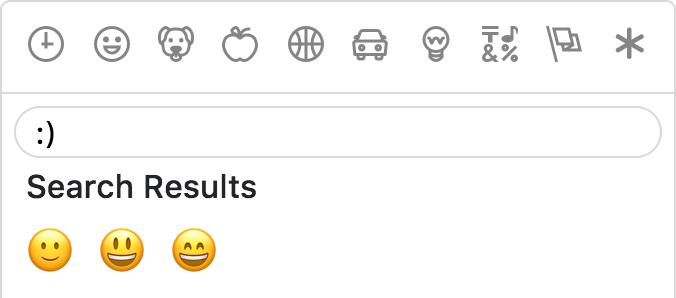
For better results, Emoji Mart split search into words and only returns results matching both terms.


As the developer, you have control over which skin color is used by default.

It can however be overwritten as per user preference.

Apple / Google / Twitter / EmojiOne / Messenger / Facebook

Emoji Mart doesn’t automatically insert anything into a text input, nor does it show or hide itself. It simply returns an emoji object. It’s up to the developer to mount/unmount (it’s fast!) and position the picker. You can use the returned object as props for the EmojiMart.Emoji component. You could also use emoji.colons to insert text into a textarea or emoji.native to use the emoji.
Emoji Mart can be used with React alternatives such as Preact, Inferno, and react-lite.
Furthermore, you can use it as a custom element using remount, meaning that you can use it within any JavaScript framework (or vanilla JS).
For an end-to-end example of how to do this, see emoji-mart-outside-react.
Emoji Mart comes in three flavors:
dist
dist-es
dist-modern
dist is the standard build with the highest level of compatibility.dist-es is the same, but uses ES modules for better tree-shaking.dist-modern removes features not needed in modern evergreen browsers (i.e. latest Chrome, Edge, Firefox, and Safari).The default builds are dist and dist-es. (In Webpack, one or the other will be chosen based on your resolve main fields.)
If you want to use dist-modern, you must explicitly import it:
import { Picker } from 'emoji-mart/dist-modern/index.js'
Using something like Babel, you can transpile the modern build to suit your own needs.
To remove prop-types in production, use babel-plugin-transform-react-remove-prop-types:
npm install --save-dev babel-plugin-transform-react-remove-prop-types
Then add to your .babelrc:
"plugins": [
  [
    "transform-react-remove-prop-types",
    {
      "removeImport": true,
      "additionalLibraries": [
        "../../utils/shared-props"
      ]
    }
  ]
]
You'll also need to ensure that Babel is transpiling emoji-mart, e.g. by not excluding node_modules in babel-loader.
yarn build
In two separate tabs:
yarn start
yarn storybook
The storybook is hosted at localhost:6006, and the code will be built on-the-fly.
Powered by iamcal/emoji-data and inspired by iamcal/js-emoji.
🙌🏼 Cal Henderson.
FAQs
Emoji picker for the web
We found that emoji-mart demonstrated a healthy version release cadence and project activity because the last version was released less than a year ago. It has 2 open source maintainers collaborating on the project.
Did you know?

Socket for GitHub automatically highlights issues in each pull request and monitors the health of all your open source dependencies. Discover the contents of your packages and block harmful activity before you install or update your dependencies.
Security News
Oracle seeks to dismiss fraud claims in the JavaScript trademark dispute, delaying the case and avoiding questions about its right to the name.

Security News
The Linux Foundation is warning open source developers that compliance with global sanctions is mandatory, highlighting legal risks and restrictions on contributions.

Security News
Maven Central now validates Sigstore signatures, making it easier for developers to verify the provenance of Java packages.